4 common website campaign mistakes to look out for
Marketing campaigns are essential for a business’ success. They can grow your company’s profile, lead users to your website, and reach out to new target audiences.
Of course, they can also represent the first time a potential customer engages with your brand. This means that everything needs to work properly so that new users have a smooth and positive experience. After all, imagine a new wave of potential customers navigating to a landing page only to experience frustrating issues. That first visit is likely to define your new audience’s perception of your brand and determine whether or not they will stay on the website and make a purchase.
So, how precisely do you go about avoiding such a scenario? While there isn’t one, catch-all approach or technique, the best way to start ensuring the success of your campaign is to understand some of the most common mistakes companies make.
It’s for that exact purpose that we’ve put this article together! Let’s review the 4 most common issues with campaigns and how you can prepare for or avoid them entirely.

1. Too much success
Obviously, it goes without saying that the goal of every campaign is to achieve success. However, depending on your specific objectives, you might ultimately end up with too much of a good thing.
Imagine the following scenario: your business launches a major campaign that is met with an incredible reception. Everything fires on all cylinders and a new wave of users flock to your website, likely navigating directly from campaign posts. This is a massive success, especially considering that improving visibility and awareness represented a major campaign objective.
But what exactly happens once all those new users land on your site? While before, your infrastructure was designed to support traffic volumes based on daily averages, this spike far exceeds that. Rather than all of these new audience members seeing the best you have to offer, your website ends up overwhelmed and proves incapable of handling the sheer number of visitors.
Now, we understand that preparing for success that exceeds expectations is difficult. And too much success certainly sounds like a good problem to have! But if all of your new users collide with a slow or even crashed website or application when engaging for the first time, it results in a great deal of frustration on their end and high bounce rates for you. That new audience isn’t likely to stick around, hoping that your interface gets fixed quickly. Instead, they’ll look elsewhere and all of that success will be for naught.
So, how can you avoid this scenario? Most importantly, you’ll need to communicate effectively with your developers. Let them know in advance to expect a spike in user numbers and provide a general idea of the scale. This will give them an opportunity to prepare the cache and upscale the infrastructure in advance so that you can handle the incoming wave of users. Finally, make sure that your developers aren’t just focused on their KPIs but also take yours into account while preparing for a successful campaign.

2. A critical form fails to function properly
Let’s back up our scenario and assume you’ve got your infrastructure scaled successfully and your cache prepared. When the traffic spike arrives, your website or application manages to hold up under pressure. What other dangers are potentially hiding in wait?
Well, the goal of any campaign should go beyond simply getting new visitors to engage with your brand. Obviously, page visits or application use should ideally lead to a specific action. However, if that action involves a key element that doesn’t work correctly, you won’t be able to convert the success of your campaign into a fulfillment of your primary objectives. While awareness of your company might grow, how many new visitors will simply leave and not return if you haven’t ensured that the next step of their ideal journey operates correctly?
Avoiding this kind of malfunction requires copious testing of your landing page prior to the campaign going live. Make sure to run a smoke test that thoroughly examines the performance of every critical feature of the page. But even once this is done, make sure that testing continues after the launch. This ensures that you will know the effectiveness of your page both in a test and live environment.
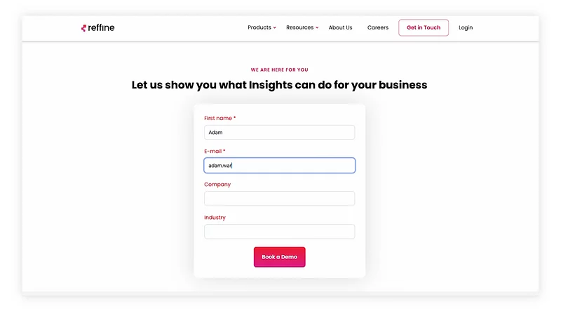
Finally, we recommend that you actually go through the entire customer journey yourself. Open the form, fill it out, and send it. Once this process is completed, check in on your customer relationship management (CRM) platform. While this degree of review and confirmation might seem excessive, running through the process from the landing page to your back-end systems casts a wide net as you search for potential issues.
And, to guarantee that you’ve tested the customer journey for all potential visitors, you must test this process on both desktop and mobile. In some cases, a form might function as expected on a laptop, only to suffer from poor performance or fault layouting when forced into a mobile format.

3. Overlapping components
Alright, so you’ve made sure that your infrastructure can support additional traffic and that the form on your landing page works. Surely, that must guarantee that your campaign will achieve a complete and memorable success, right?
Unfortunately, functionality is not the be-all and end-all of an effective campaign. Even if your website or application works exactly as intended, unexpected challenges related to its layout can prove to be yet another obstacle interrupting your path to success. After all, if your call to action relies on a button or a form that has to compete for space within a cluttered layout, how many users will be able to properly engage?
We have seen instances of companies with fantastic websites and excellent campaigns run into these formatting problems. One of the most common ways a company can get tripped up here regards the transition from desktop to mobile. Often, an organization will focus too much on one kind of device or other without properly reviewing other options. So, a page that presents itself clearly to a user on a computer could end up messy and confusing for someone on their phone.
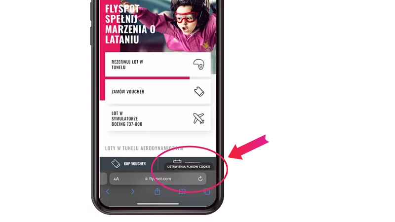
Just picture finding a new site that you’re excited to use. However, when you go to look for an option to engage directly, the contact button has to compete for space with cookie consent or a chat feature. It would prove discouraging and likely bring that potential engagement to the end. From a business perspective, that means lower conversion rates and poor user satisfaction, neither of which indicate success.
Once again, testing will be your best friend here. When you’re working to set up the landing page, review its performance in a production environment and pre-production staging. This combination provides both an easy opportunity to stress test your site and an effective replication of the user experience. With this comprehensive approach to web page review, unexpected layouting errors will become a thing of the past!

4. Broken links
At last, you’ve reached a point at which your website or application is ready for an influx of users, all critical elements work, the format is user friendly on all devices. Unfortunately, that still leaves one more incredibly common issue that can make it difficult to achieve a successful campaign: broken links.
More specifically this means that while your call to action works well technically, the link connected to it is incorrect. As a result, whenever a user clicks on a button they expect to direct them to another page to learn more, they instead receive an error message. This brings the user journey to an unsatisfactory end in the form of a dead end. Even if a potential customer navigates back to the previous page, they’ll have no obvious path forward. So, while your services or offerings might be relevant to their needs, they will ultimately have to go somewhere else, whether they want to or not.
This situation typically arises when an organization makes a change to its set up or platforms. If you transition to a new service provider, your urls might change, meaning that anything you’ve already established won’t work. Another potential cause can be differences between staging and production.
In reality, this is one of the easiest mistakes to make and overlook, as it requires awareness of upcoming or recent changes and all of their potential implications. Fortunately, that doesn’t mean you have no options to preempt this issue. In a recurring theme in this article, thorough and extensive testing helps identify broken links ahead of your launch. In addition, some SEO tools, such as Ahrefs, can check if this has happened and warn you before it becomes an issue.
With care and awareness, you can ensure that every link featured on your landing page leads precisely where you desire.

Protect your campaigns with knowledge and testing
Of course, there are more details to consider and be aware of than the four we’ve covered here. Just addressing these common mistakes won’t guarantee flawless campaigns that fulfill every single objective and exceed expectations.
But if there is any message we hope lingers with you, it’s that advanced and thorough testing saves marketing campaigns. Knowing the common downfalls marketers need to avoid is important, but nothing can replace iterative review and stress tests. That way, you’ll always be prepared for potential challenges, whether you know to expect them in advance or not!

The factors that determine differing page speed in different markets
As with many things in life, page speed isn’t simple.
Depending on your geographical location or that of your audience, the performance of your website can be radically different. Understanding why this is the case is the first step to discovering a solution.

 English
 한국어
한국어
